

What is Negative Correlation?
The easiest way to introduce negative correlation – and the concept of correlation in general – is by discussing scatter graphs.
Scatter graphs are a useful tool for displaying the relationship, or “correlation”, between two variables. They can be used to establish first and foremost whether any relationship exists between the two variables, and then if so, to explore and quantify the nature of that relationship.
Let’s explore how to create a scatter graph with a simple example.
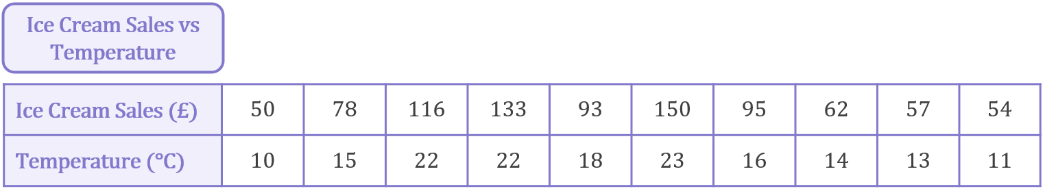
It’s pretty fair to assume that ice cream trucks sell more ice cream on hot days than on cooler days, right? Suppose an ice cream truck tracks its sales over 10 days in the autumn and records the temperature on each day. The results were as follows:
Plotting temperature on the x-axis and sales on the y-axis, we can convert each column of information into a datapoint on a scatter graph:
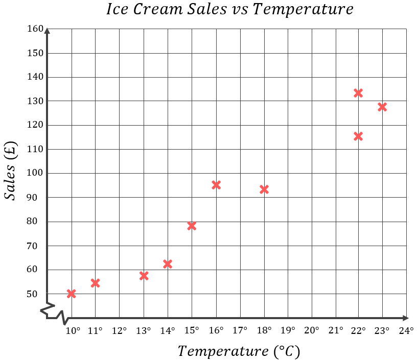
As we anticipated, the data confirms that, generally speaking, the greater the temperature, the more ice cream we can expect to sell. With only 10 days’ worth of data the overall trend is still clear – as temperature increases, sales of ice cream also increase.
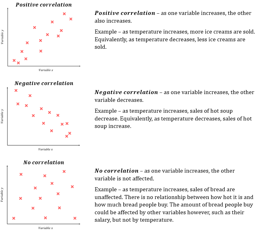
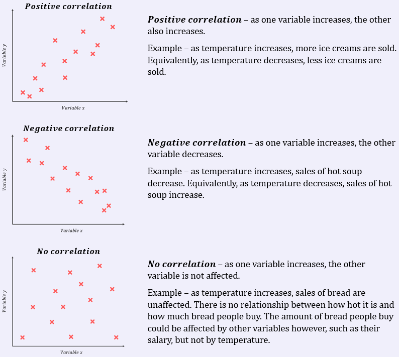
This is an example of positive correlation. A positive correlation between two variables means that as one variable increases, the other also increases. In this case, we would describe temperature and ice cream sales as being “positively correlated”.
As you might imagine, variables are not always positively correlated. Sticking with food examples, what do you think the relationship between hot soup sales and temperature might be? It’s fairly safe to assume that as temperature increases, the sales of hot soup are likely to decrease, aren’t they? Or looking at it the other way, as temperature decreases the sales of hot soup are likely to increase. This is an example of negative correlation. A negative correlation between two variables means that as one variable increases, the other variable decreases.
But what about something that people always buy, like bread – how do you think bread sales might vary with temperature? Do you think the temperature would affect bread sales at all? I don’t think so – bread is a daily essential that people buy all year round, irrespective of how hot or cold it might be. This is an example of no correlation, or variables which are “uncorrelated”. If there is no correlation between two variables, then as one variable increases, the other variable is not affected. The two variables have no relationship – they have nothing to do with each other.
The three basic correlation types are summarised below:
Returning to our ice cream example – which was an example of positive correlation – lets now introduce the concept of a line of best fit:
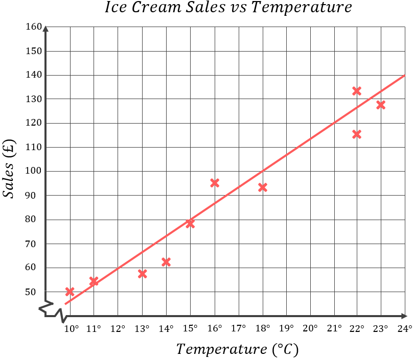
A line of best fit, or “trend line”, is a straight line that best represents the data on a scatter graph. This line may pass through some of the points, none of the points, or all of the points, but the idea is for the line to give an accurate representation of the overall trend of the data.
As a rule of thumb, when drawing a line of best fit aim to have a roughly equal number of datapoints on either side of the line – this usually means you’re drawing an accurate line.
As you can see, the line of best fit I’ve drawn on slopes upwards moving from left to right – in doing so, it emphasises the positive correlation of the underlying data in this case.
There are various complex methods for drawing a line of best fit accurately, but those are beyond the scope of this course (it’s a whole area of study at the University level). At National 5 level, you will only be expected to draw a line of best fit “by eye”. This means you simply need to draw the line such that it passes as close to as many of the datapoints as possible, but there’s no exact line your examiner is expecting. Your line of best fit may well be a bit different to a line your friend would draw, but that’s ok so long as your line reflects the correlation of the data accurately (i.e. positive or negative correlation).
In the next topic, we will see how the equation of a line of best fit can be used to quantify the relationship between the two variables in a scatter graph which allows us to make predictions about results we do not have actual data to support.
Key Outcomes
Scatter graphs are a useful tool for displaying the relationship, or “correlation”, between two variables:
A line of best fit, or “trend line”, is a straight line that best represents the data on a scatter graph. This line may pass through some of the points, none of the points, or all of the points, but the idea is for the line to give an accurate representation of the overall trend of the data.
As a rule of thumb, when drawing a line of best fit aim to have a roughly equal number of datapoints on either side of the line – this usually means you’re drawing an accurate line.